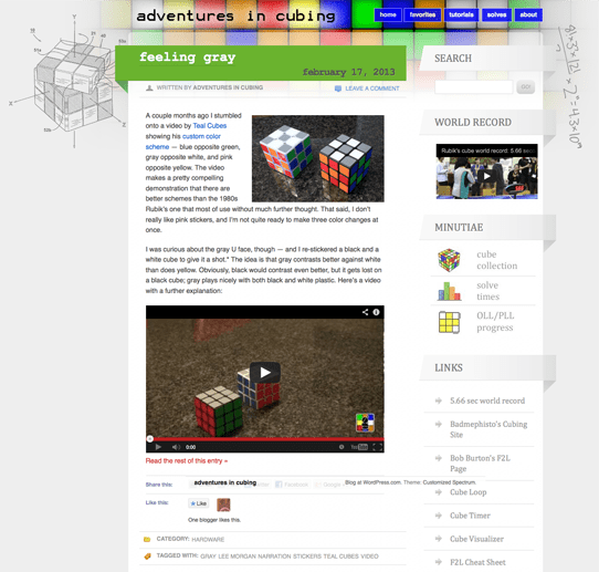
Welcome to the newly designed Adventures in Cubing! Goodbye, old cluttered site….
 It is ironic, I suppose, that I spent so little time designing the last site — given that I’ve developed probably a dozen other sites, all with painstaking forethought, planning, and attention to detail. By contrast, I assembled the original AIC slapdash in about an hour. Tempered by self-consciousness and certain that the blog would die on the vine, my goal was to keep it wordpress.com-hosted (so much easier than self-hosting), avoid jquery/php/html editing (modifying only CSS via the Custom Design add-on), and put as little time into it as possible (about 90 minutes). So, I loaded up the Spectrum theme, played around with the CSS, and called it a day.
That was about 14 months ago. Now that the blog has matured and I am more certain of its future, I wanted to develop a more polished and refined site. For me, that means a far more minimal and clean design language. I think I’ve accomplished that here, with a customized version of the free Twenty Twelve theme. The full-width header is simple, with its bold color and now-front-and-center logo. The integrated search box with the image-sprited magnifying glass submit button took a fair bit of work, given that I had only CSS with which to work. Some negative margins did the trick, but they do break the blog in Explorer. (Oh well…. I’m done developing for users browsing with hoary technology.) The understated sidebar distracts less from the more important post content, while keeping sprited icons for the Minutiae section.
In the name of posterity and in the spirit of contrast, here’s a reminder of what the old site looked like (click to enlarge):

While there’s still a lot of fine sanding left, I’m pleased with the basic structure. I don’t think the default theme handles comment links very well, plopping them awkwardly at the top of posts without any thoughtful integration. Without the ability to get at the html/php structure, I can’t extract just the comment number (to place in a subtle speech bubble or megaphone or the like). For now, I’ve opted to hide (display:none) the links. The post footers need some refining still, too. It might be time, finally, to drop Feliks’ video; for now, I dropped it to the bottom of the sidebar. I’m also exploring different link colors (I surprised myself by liking red hovering to gray) and whether I want to underline them in their normal or hover states. And there’s a bunch of old per-post styling I had shortsightedly done that I now want to pull into the stylesheet.
All in due time….

 I’ve been a little obsessed with finding the perfect logo and the perfect logo stickers to go with it. I think this is my third or fourth post about logos and stickers, having previously written about stickers from both
  It is ironic, I suppose, that I spent so little time designing the last site — given that I’ve developed probably a dozen other sites, all with painstaking forethought, planning, and attention to detail. By contrast, I assembled the original AIC slapdash in about an hour. Tempered by